Showing posts with label Handmade. Show all posts

Tuesday, March 14, 2017

Copics and Rocks

You might be asking why Copic markers and rocks, well let me explain.  In case you have not heard rock painting is a thing.  There are groups of people all over the place that paint and hide rocks for other people to find.  They are meant to be inspirational and brighten someones day.  I'm part of a local group.

Here are some rocks from my last batch that I painted. These were done with acrylic paints and black markers.

I've even water colored some. But what I have never tried was Copic markers on a rock.  I saw in a group some where on Facebook that someone had used the Chameleon markers so I figured why not try Copics.

I started with my rock and a inked line drawing on my rock.  A simple fairy door.  The thicker lines were done using Staedtler Lumocolor and the thin lines in the door and window using a fountain pen.
I figured I would start with the wood texture on the door and try coloring that in.  I chose to use E31, E33, E35, E57 and E59.  I stated with the lightest color E31 but soon realized that the Lumocolor was not Copic friendly, it smudged.  I did my best to avoid touching any of the Lumocolor lines with the Copics.  The fountain pen was safe to color over.  I flicked in some of the E33, E35, E57 and shaded around the door.  I darkened the Lumocolor lines with the E59 to ad some depth.  I then went back over everything with my E31 to blend and then flicked and shaded some more.  The only thing I noticed was, at one time there seemed to be a build up of ink on the rock because after so many layers it didn't seem to be absorbing in.  So I figured I was done then. 

I went on to color in the window using Y15 and YR12, again avoiding the Lumocolor lines.

Next I colored in the stone around the door and at the bottom of the door using W2, W3 and W5.
For around the door I wanted a grown in flowery look so I opted to switch to acrylic paints and a sponge.  Sponged on a dark green for the base, then a light green for some highlights.  I then went in to a few spots with a dark purple and light purple to give the illusion of flowers.
I dry brushed some dark green and light green acrylic to the bottom of the rock for grass and called it a day.  All that is left is to seal it with a sealer.


Do Copics work on rock? Yes they absolutely do.  However I will use a liner pen that is Copic friendly next time.  I just did not think to test out the Lumocolor first so that was my fault for using it. 

Wednesday, November 30, 2016

Lindy's Stamp Gang November Challenge

Well it's been a long time since I've written about anything that I've done.  With all the social media out there the blog has kind of fallen by the wayside for a bit.  But I'm back and ready to go with a new project for a monthly challenge.

This month's, November, 
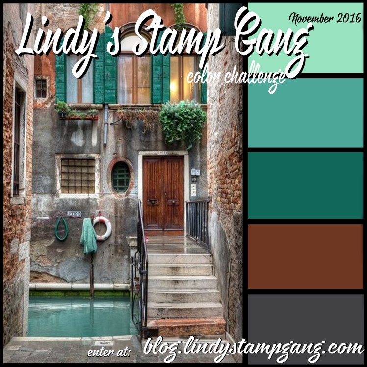
challenge is put on by Lindy's Stamp Gang.  They make these awesome sprays in both micas and flats. Every month they put together a pallet of spray/embossing powder colors inspired by a picture. The challenge to create something using these sprays/powders.  

I saw this months picture and color pallet and was immediately inspired.  How could you not be, I mean it's a lovely picture with a gorgeous pallet.


I could just picture the way that I wanted to use these colors on a mixed media canvas...And so it began...

I started with a 9 x 12 gallery wrapped canvas.  I like the gallery wrapped that have some depth to them so that I can have more room to work on the sides of the canvas.  I knew that this pallet set was going to go fan-spanking-tastic with the Graphic 45 paper, Voyage Beneath the Sea Collection, that I had recently picked up.  So I started fussy cutting...

I figured out where I was going to add my fussy cut out things.  Then I added some texture paste, cut up doilies, sand paste and then gessoed it.


I added some found items, and cameo cuts.  I even molded some bits from paper clay using a IOD and Martha Stewart mold. 

After gluing everything down it all got coated with 3 layers of gesso. Once dry I sprayed it with an array of Lindy's sprays.


 Then I had to add my fussy cut out paper and lots more embellishments.


I went back in around the mermaid with some of the sprays and a paint brush to give it the look of the water being darker and to add some color to her hair and fins. 


Some of the supplies used in this project include:


Graphic 45 - Voyage Beneath the Sea #4501320

IOD Prima Marketing - Paper Clay #841991, Mould Baroque 6 #814823

Martha Stewart Mold - Nautical Collection

Prima Marketing Flowers - #553302 Coventry Rose Romantique, #562472 Perles-Zephyr, #562519 Zephyr Bosque, #556358 Velvet Rainbow Spring Mix, #552237 Powder Puffs Marie, #701307 Petal Palette Tube Brown, #553012 Gillian Coffee

Plus lots of other found and misc items. :)


Tuesday, June 9, 2015

Heirloom Rubber Stamp and Paper Arts Show

This past weekend was the Heirloom Rubber Stamp and Paper Art Show.  I wanted to go but was worried about bringing the kids to this show.  I knew in my mind what I was setting myself up for; "I'm bored" and "How much longer?"  I could see it already.  My hubby said that we would just give it a try and see just how things went.

We have never been to a rubber stamp or paper art show so we didn't really know what to expect. I have to say we were pleasantly surprised.  We spent just over two hours there.  There was so much to see and do that it kept the kids occupied.  I think they did every make and take there was. They had a blast. Thank God they're crafty kids.

 My youngest is a touchy kid so the make and takes were a great way for her to have her hands busy and involved.  The oldest gets tired and cranky fast but we had none of that until the ride home. I was so impressed on how good they were and by what they made. It just made me beam with happiness. :)   

The first stop was the roughest. We stopped by Endless Creations and Everyday Cards.  The lady at the booth was a saint. She worked with the kids to explain how to use the different stamps and the basic how to's of card making.  My youngest got frustrated right of the bat because the words she stamped in her flags were not straight.  Needless to say it took a lot of talk from my hubby to convince her to go on and that every card is different. I have to say the cards came out so neat.


After this we sent them off on their own with money to do the make and takes. Their next stop was at Local King Rubber Stamp.  There they tried out some marker on stamp techniques.  I have to say they did a good job.


Next they headed to Stamp on It where they used some 3D crystal lacquer, glitter and foil stickers to make a card.  These came out amazing. I loved how the 3D crystal lacquer and glitter work so much so that I picked up some acetate and a kit that they had with the lacquer in it.


Somewhere along the line they found a place to try out the Winks of Stella.  


Lastly it was off to Craft Fantastic where the girls each made two necklaces.


They did all this while we shopped and walked around spying some great tags, cards and demos.


Here is two amazing demos from Impression Obsessions both on the Pan Pastels. These are a must get!


Wednesday, April 1, 2015

Making your own decorative tissue paper!

That's right you can make you own decorative tissue paper and it's easy!

All you need to start is an old sewing patter, some Tim Holtz Distress ink, or any ink would probably do, some stamps and an acrylic block for your stamps if needed.

Your patterns don't have to be new. I bought my sewing patterns at my local flea market, they were three for a dollar.  Take out a piece of the pattern big enough for your project and lay it on your crafting surface face down.

Next get out your inks and start stamping... That's it! Easy peasy.

Make sure as you stamp you rotate the direction of your stamp so the images are not uniform, unless that is what you are going for.

Here's a video of me making some for a canvas I'm planning:


In this video I wanted a sort of vintage color to it so I used some Distress Ink in the Walnut Stain color.  And because my canvas is going to be a floral piece I used the floral stamps I had; Tim Holtz Stampers Anonymous - Flights of Fancy, Stampin' Up - Bloomin' Beautiful, and Prima Marketing - Hello Pastel - #563004.

Thursday, March 26, 2015

Things are changing...

Things come and go, and things change in the world.  That's just the way things are. I'm not one who really likes change but I think this change is welcomed.

It all started about a month ago.  ArtFire, who I've been with for a long time, has decided to make some business changes.  They decided to put ads on product listings. It's not just one ad or two small ads it's a bombardment of ads.  Ads at the bottom of the pictures and ads just below the shop categories make it hard to tell if the links are for my product or someone else.  This is their business and it's their decision to make.  They feel they need the income revenue from the ads.  It's a decision I don't like. Personally I don't like having ads all over product pages that I am looking at. I don't like feeling bombarded by them and I do not like the placement of the ads.  This and more has lead me to step away from ArtFire. March 31 will by my final day there and I have to say I don't think it's going to be a bad thing. I have moved on to, hopefully, bigger and better things.

I opened a Zibbet shop that will now house supplies. The tons of supplies I have been sitting on for some reason or another will now be making there way into that shop. There will be beads, toggles, charms, book binding supplies and more.  It's going to take me a bit to get everything in there but I'm determined to do it.

So what's going to happen to everything that's in my ArtFire store...Well, that's getting moved to my Etsy shop.  This will become my main shop where all my goodies can be found.  New photo's will be taken of some older products from when my photographing skills were severely lacking.  I'm hoping to expand upon things there in the future as well.  Keeping my fingers crossed that when they change things around there they will be gracious enough to give us a few more shop sections.  I am doing my best right now to try to make things as easy as possible for everyone to find and once the shop gets really full I will add some special links to help sort my products in my announcement there.

I'm really excited about how this and have a really good feeling about it all. So for now I'll leave you with a new product. An altered composition notebook.  All signs of it being a composition notebook have been erased. It is completely covered outside with a crinkled blue paper and a black velvet paper on the spine.  The interiors of the covers have a decorative light blue paper with white marks covering them up.  On the front cover are a few fabric flowers with some white and blue feathers.  All this leaves you with beautiful notebook with lined pages inside to write whatever you'd like.

Blue Fabric Flowers and Feathers Altered Composition Notebook Journal
Altered Blue Composition Notebook


Thursday, March 5, 2015

Working on Embellishments

I figured I share with you some embellishment making for my next mixed media canvas I'm going to be working on.

I have some laser cut wood pieces from Michael's, a chandelier and a chair.  I also have a Tattered Angels frame that I want to turn into a mirror.

I start off by gessoing everything with a white gesso.  Then I paint on some Liquitex titan white paint to brighten it up.  After that I paint on some Liquitex black acrylic paint to the chandelier where the metal look will and the piece for the mirror.  Because I want to give them an aged metal look the base needs to be dark.  I paint on a coat of Golden titan buff fluid acrylic on the chair to give it a softer look. Once the black base coat for the metal is dry I dry brush on some Blick acrylic silver and copper paints. I put those aside to dry.

While the chandelier and the mirror are drying I decide to work more on the chair. I cut out a piece of pattern paper for the cushion, making sure there are tabs so that I can make it pop out.  At Michael's I found this pink ruffle ribbon that I want to use for the ruffle on the chair.  To age the ribbon I use some Tim Holtz walnut distress stain and lots of water.  This dulls down the pink so it's not so vibrant and new looking.  I also brushed a little of the stain on the chair to give it a little bit of a worn look.

Going back to the chandelier I wanted to make it look like the strands of beads are pearls and the hanging parts are pink crystals so I grabbed my Pebeo 3D pink crystal paint and some white liquid pearls.  Carefully I apply a dot of liquid pearls to each of the round sections of the strands and the 3d paint to where the crystals would be.

Everything dried over night and I assembled the chair eventually adding some liquid pearl trim where the paper and the fabric meet to give it a more finished look.  I'm not quite sure if I'm happy with the metal chandelier or mirror frame.  We'll just have to wait and see what I decided when I put the canvas together.


Sunday, March 1, 2015

Mixed Media Canvas - Inspire

It's been so long since I've posted.  It's just been crazy around here between the conventions, followed by the holidays, and then the crazy winter we've been having. The kids being home from school for what seems like forever due to snow days has not helped out the craziness.  It feels so good to be able to sit and write for few. 


My latest completed project is a mixed media canvas titled "Inspire."  I got inspired to do this piece from a sort of kit I picked up at my local scrapbook shops tag sale.  The kit contained a lot of sewing items including a smaller version of the dress from that appears on the canvas.  The dress form really got me thinking about an altered Barbie doll I had planned on making but never got very far with.  I figured I'd take what I had planned for the doll, minus the face and ear details, and put it on a canvas.

The fair wings I had made so long ago when first planning this doll. They are fabric backed, color wire formed and slightly pose-able when heated.  I add a little matching glitter to them to give them the shine I wanted. 

The dress that you see is pretty close to the dress I had planed for the doll as well.  It is made from all the fabric I had original picked up to use.  The only difference is that the black outline on the top is a 3 dimensional paint from Pebeo and not trim. 

The canvas is a brown linen canvas from Michael's that I applied clear gesso to and then layered on some Recollections Signature printed tissue paper and Prima Marketing paper Madeline Collection "Beautima" #842383.  I went ahead and grabbed my modeling paste and my Ronda Palazzari Designs "Texturized" stencil and added some texture. Once the paste dried I sprayed on some Plain Jane Baseboard "Gravel" mist and Tattered Angels Glimmer Mists in "Latte" and "Cork." 

I made the stain glass looking window from a dollie that was a kit I picked up.  I cut the center of the dollie out and sprayed it with some Heidi Swapp Color Shine Sprays in teal and chartreuse.  Then I drew on the design in the black Pebeo 3 dimensional paint. 

Finally I glued on all the embellishments which included Prima Marketing flowers and pearls, Tattered Angels chips, wood word Inspire, the dollie and the dress. Viola finished canvas.

Want to see how it was created or the list of products used, check out my YouTube video:


Sunday, October 12, 2014

From Trash to Treasure

From Trash to Treasure...I found a broken journal at one of my local Michael's and couldn't resist buying it.  I had to see what I could do.  Looking at it the only thing wrong was that the elastic closure was pulled out from where it should have been tucked into the book. That's a slightly easy fix if things go the way they should. 

I brought the journal home, repaired the elastic (thankfully everything did go the way it should,) and got to work on painting. I painted and painted and painstakingly painted with the tiniest brush I had. 

All in all it took me about four to five days of painting on and off.  The intricacy and the tiny details made my eyes go buggy.  I had to do it in sections and at intervals to give my eyes a break. 
Looking at the brown and the gold I immediately thought that this book was screaming to be a steampunk book. I set off to find a digital steampunk stamp that would be a perfect fit for this book.

I came across that stamp on StitchyBearStamps by a creator known as BB Kakes.

http://stitchybearstamps.com/shop/index.php?main_page=product_info&cPath=11_31&products_id=3127

Steampunk - 3 pc set

I purchased it, read the TOU to make sure it I was within the right to use it for this project, and printed it out a few time on some Copic marker friendly paper.

Why a few times you might, well it's so I can use one test colors and play with, one to lay out my colors, figure out shading and how I'm going to finish it, and the last one to do my final colors on.

Here's my second one with my colors listed so I know which markers to use where on the final.


And here is the final all colored and fussy cut out.

 On the final image I used Tim Holtz's Distress Stains and Paints for the gears and metal. I used some Ranger Glossy Accents on the glasses and the face of the pocket watch after shading in the gray color to give them the glass look.

Then it was off to the book....

I used some Prima Marketing Engraver Collection "Cesello" (845315) paper as the back ground.  Glued my stamp just off center.  I placed the "Jouranl" sticker from Prima's Engraver collection (563479) so that the end of the sticker lined up with the edge of her shoulder.
I used some Prima flowers for embellishment (Black rose -552619, Small maroon roses - 553302.)  On one of the small roses I pulled out the center of the rose and added a button (550776.) The key paper clip (564681) I cut the clip part off of to make it look like just a key.  I then added miscellaneous mechanicals, gears from Tim Holtz and Bead Landing along with some clock hands and key hole from Bead Landing.

Here's the journal all finished:


Monday, June 30, 2014

Make it Crafty Coloring Challenge #10

Cutting it close with this one. Last day of the month posting....It's been a crazy month with the kiddos last few days of school just last week. I managed to squeeze in some time to do some coloring for the new Make-it-Crafty's  coloring challenge.  In case, you missed my posts for a few months you these coloring challenges are a fun way to challenge or work on your coloring skills.

So there are two different challenges, a hard and an easy one.  This month the hard is coloring curly hair and the easy is coloring with pink and brown.  Because I was on such a time crunch this month I opted for the easy one.

Lets see....I started with two different digital stamps from Make-it-Crafty.

Here's the first: 
 

And the second was:

Sitting Annalise Digi Stamp


I chose these two images because it was also "something girly" (the challenge's title, and the Facebook group challenge.)  As a little girl I loved to swing, and so do my daughters, so I thought this would be perfect to do as something girly.


To make the final image I took the two into Photoshop; flipped Annalise, rotated her a little to line her up with the swing and removed some of the daffodils to come up with my final image.  I held off coloring until my new favorite color pencils arrived, Faber-Castell Polychromos pencils. This was the first image I colored with them and I'm in love.  They blend beautifully and lay down easily, by far the best pencils I've used.  To top it off all of Faber-Castell's lines match so you can use markers, pencils and watercolors with ease. So excited to do more with their products.

Any who....I used my finial colored image to alter a medium sized Moleskin lined journal.  Added some new Prima Marketing Inc. flowers to it.  Throw in some papers, Tim Holtz Distress Stickles, glitter, metal frame, Silks paints, leaves and a fun inspiring saying and you get the finished journal.  By the way the cute little saying is "In a sky full of stars it's amazing to find that each is one-of-a-kind."

I hope you like it...


Tuesday, June 10, 2014

My Comic Book Book - Lady Mechanika

My Comic Book Book.....This book took me a bit of luck to make.   When I found out that my husband was going to set up a Hartford Comic Con I decided I was going to make a book for it.  I  wanted to make the book from one of my favorite comics out there, Lady Mechanika.  I did not want to use one of my many copies of the comic so I had to find a book that was a duplicate to one that I already owned.  (Yes, I am one of those people who collects the many different covers.)  That was not an easy feat.  The book is very hard to come by now, so it took some calling, driving to different shops but I finally found one about an hour from me.

The book started out looking just like any other comic book. I was a little worried to take the comic apart and use it, afraid I would mess it up some how, either gluing or cutting it.  One mistake would lead to a very frustrated and mad me.  Needless to say with all the worry I took my time with it.

Over all the book took me just over a week start to finish including the pressing and drying times.  The front cover of the book is the front cover of the comic.  The signatures are surround by the cut interior pages of the comic (I wish I could have kept them full size.)  I kept them in order so you can at least read the first pages of the signatures in order. The interior pages are the Toned Gray Strathmore sketch paper.  The back cover of the book I took the Recollections Clocks paper and water colored it with some Tim Holtz Distress Stains.  I Coptic stitch bound the book with some variegated brown and beige cotton thread that I waxed with local bees wax.


My Lady Mechanika comic book book!

Back and Front Covers.

Inside the Front Cover.
Inside Pages.
I brought the comic book turned sketch book to the Con with me.  Joe Benitez, creator and artist for Lady Mechanika, was set up there as well.  I was very lucky to be able to get him to do the very first sketch in the book.  <3

So now the book will be traveling with me to shows and cons, when ever I can get to them, to have others do sketches in it as well. I'm thinking a steampunk theme is in order but that was apparent from the start.


Monday, April 28, 2014

Make it Crafty Coloring Challenge #8

I'm running so far behind this month it's not even funny.  I actually managed to create something earlier in the month but just have not gotten around to actually writing in my blog.  So here it is.

This months Make it Colourful challenge:  Easy - Purple and Turquoise and Hard - Color on something other than your standard white papers.

While I love the color purple and it is by far one of my favorites I just couldn't come up with anything that I would have liked in that color scheme quickly.  (I'm sure I could have come up with something if I could squeeze an extra hour out of a day and an extra arm out of my body. Yeah, it's been one of those months.)   Anyway, I decided to forgo the easy challenge and create for the hard challenge. 

I love steampunk so I went and chose the Metal Flowers digi stamp from Make it Crafty.

Metal Flowers Digi Stamp


I wanted to use in the creation a mixed media altered Molekine cahier journal.  It took me a few print outs to figure out the size and placement of the image.  Once I figured that all out I cut a piece of Recollecions Clocks paper and ran it though the printer.  With all the text and images on the paper I had to often refer back to one of my scrap print outs to know where to color.  It definately was not easy but I am happy with the end result.


To color the paper I used:  Tim Holtz Distress Stain - Antique Linen,  Prismacolor Colored Pencils, Twinkling H2Os - Ginger Peach, Golden Fluid Acrylic - Iridescent Silver, Tim Holtz Stampers Anonymous "Artist" Stamp, and Judi Kins Gold Detail Embossing Powder. 


Tuesday, March 25, 2014

The making of a mixed media journal

I love being able to combine all different types if media when working on a project. This book was made over the course of a few days.

First I had a picture in my head of what I wanted the base cover to look like, so I gathered what I thought I would need for supplies. Tissue paper, inks, mists, glue, string and book board to work on.


Next came the layering... Starting with the twine. I glued the twine to the book board in the pattern/design I wanted.  Then layered on pieces of tissue paper.  Once dry, inks and shimmers were added until I like the way it looked.

After all that was dry I added embellishments.   Some fabric flowers, brass key and leaf, and a filigree button with black rhinestones.  
https://www.etsy.com/listing/183401566/vintage-steampunk-inspired-mixed-media?ref=pr_shop

Then it was a matter of assembling the final note book with lined pages and a black wire spiral.
It is currently available for purchase at my Etsy shop.